FORMAL ELEMENTS IMAGE SEQUENCE + ANALYSIS
Formal Elements Analysis (Sequence 1)
Colour Palette:
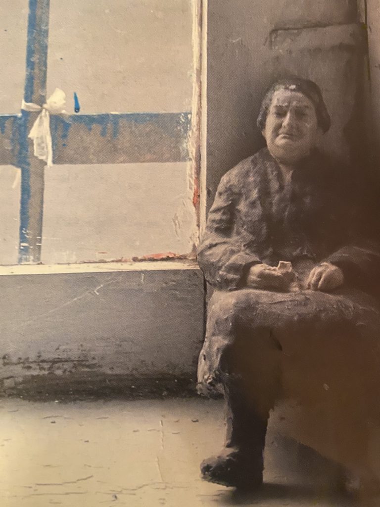
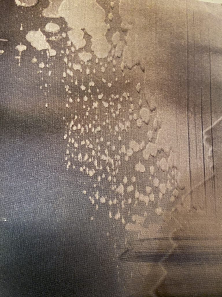
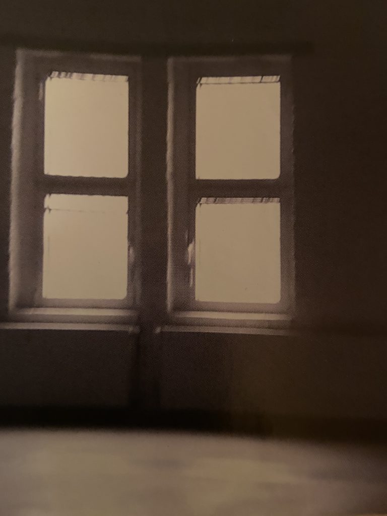
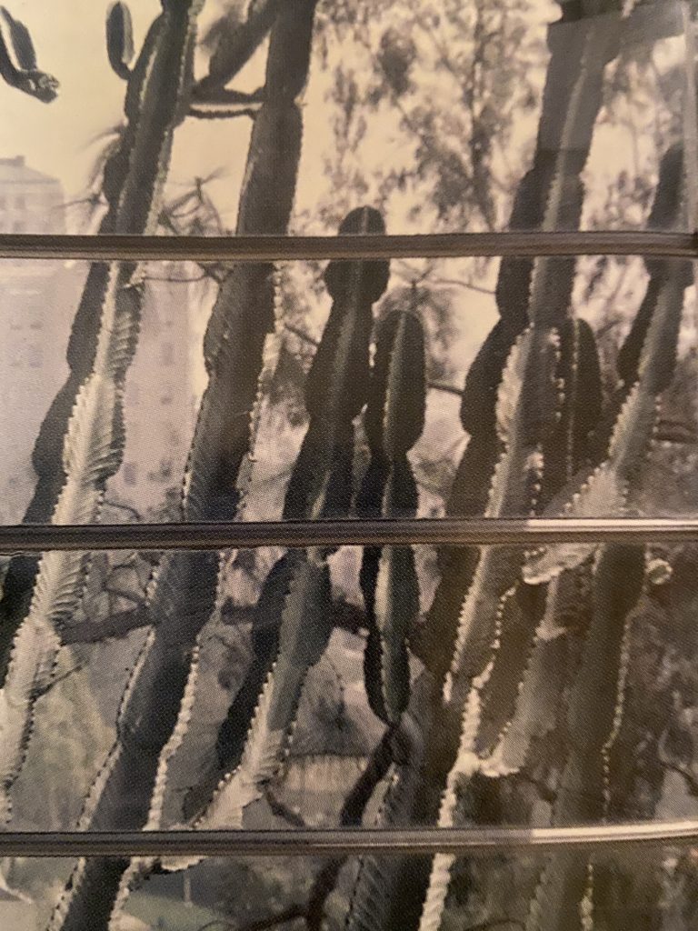
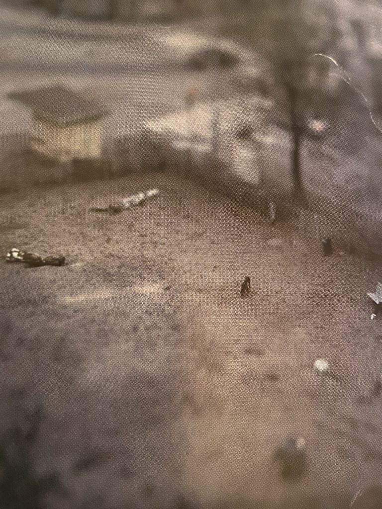
The colour palette for the entire sequence is predominantly grey scale with subtle tones of green and blue. This colour scheme creates a quiet, moody and banal feeling to the series.
Scale + Perspective:
In the first panel the composition features a small figurine of an old woman, however the interior space and window fit her scale and the perspective is shot at eye level; these two elements allow the viewer to feel like they inhabit the same imaginary world. Scale and perspective are accentuated again in the final panel, where we have a bird’s eye perspective, and we are looking down at an urban landscape with a large gravel lot. There is one tiny figure alone on a park bench. The scale play is evident as the props and figures feel like they are from a small miniature world.
Negative Space:
The play of negative space is a main compositional feature for 5 of the 6 panels, which lends the series an ethereal feel. The negative space shifts in the composition from panel to panel – this gives a feeling of unease.
Depth:
For depth there is a play of push and pull in the sequence. The first panel, the small interior space with the old lady invites (pulls) the viewer in, we are in her space. The second and third panel are both abstracts that play with textures and text, there is minimal depth and the viewer is pushed to the surface. In the fourth panel with the interior of a room with a luminous window pull us in again. The fifth panel pulls us in further with the play of two-point perspective and the receding lines and columns moving back in space. The sixth panel pushes the viewer back out, we feel contained by the bars and prickly cactus make us feel trapped and claustrophobic. The final scene we feel pushed away completely as if we are hovering over the urban scene from the sky, the image is out of focus that is a play of atmospheric perspective, the elements offer the viewer a floating sensation.
